
Challenge
Create a law-office identity that feels credible, elegant, and memorable without relying on generic legal symbols or cold corporate styling.
Branding and CGP Identity / 2026
AZ Odvetniki is built as a brand identity case study rather than a web case. The brand book, logo rules, material cues and real mockups show how the mark behaves across premium touchpoints with a discreet legal-services tone.

Client
AZ Odvetniki
Role
Brand identity, CGP system and application design
Year
2026
Deliverables
Brand book, logo rules, stationery and premium applications
Services
Create a law-office identity that feels credible, elegant, and memorable without relying on generic legal symbols or cold corporate styling.
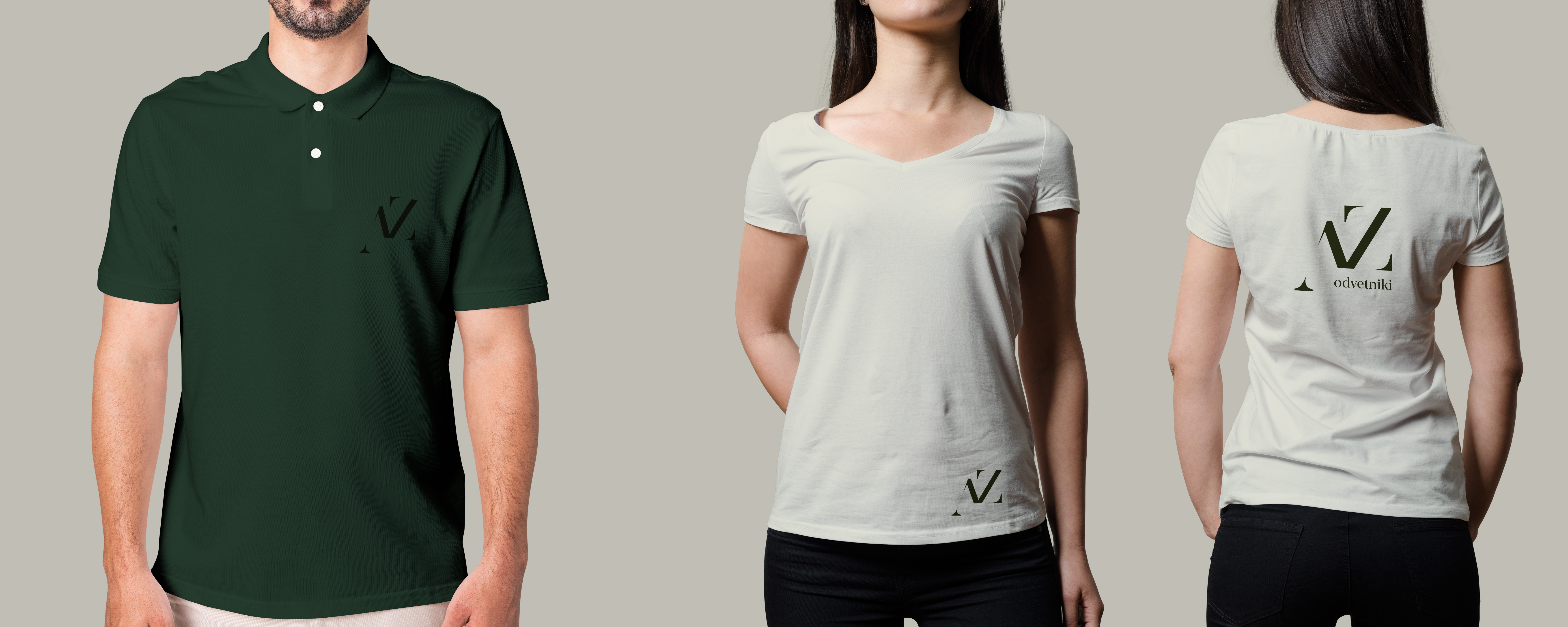
The identity is shown through controlled rules and applications: logo construction, clear-space logic, typography, tactile paper goods, wine-label detail, apparel, and premium presentation mockups.
A cohesive CGP direction that gives AZ Odvetniki a refined visual presence across formal and relationship-led brand touchpoints.
Logo evolution
A draggable before and after view shows how the AZ monogram moves from hand-drawn construction, proportion studies and negative-space notes into a clean final identity mark.
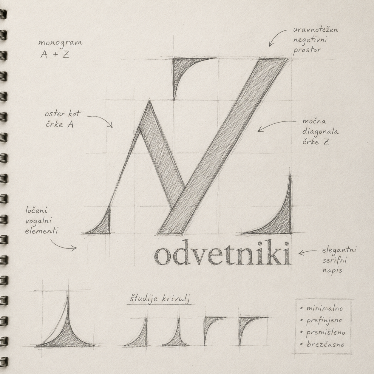

final vector mark
CGP manual
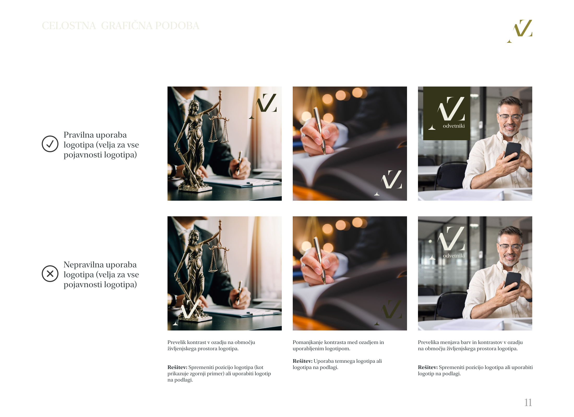
The final brand book brings the identity out of the mockup world and into rules: palette, type hierarchy, mark construction, clear space and controlled application.
Color logic
#8a8532
Primary olive
#2a3010
Deep legal green
#E8E7D9
Ivory paper
#000000
Black
Gradient
AZ
Ivory paper contrast
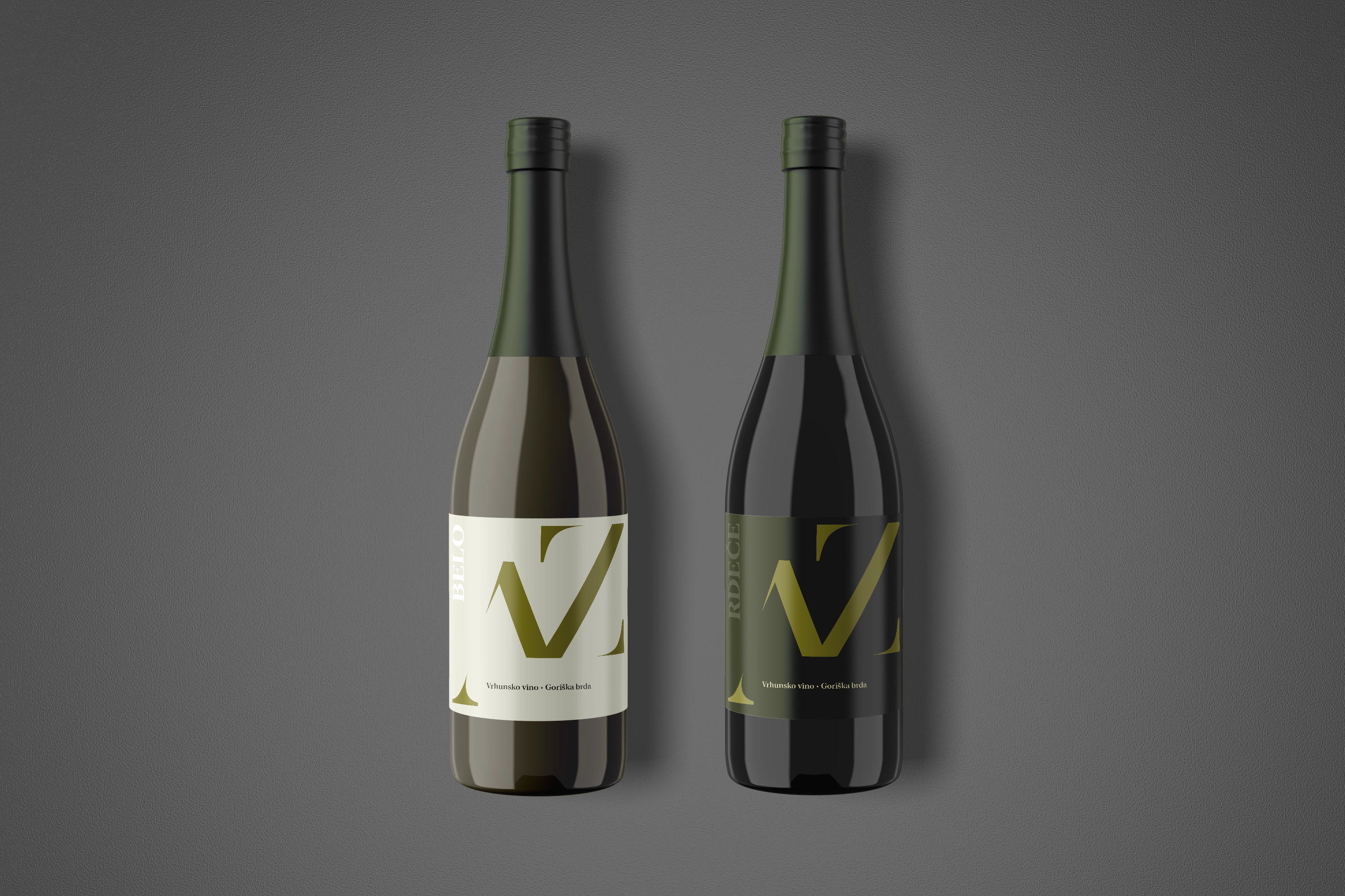
Primary print
New York Large
A formal serif voice for printed brand moments, large headlines and legal authority.
Secondary web
PT Serif
A practical serif substitute for web, documents and everyday brand communication.
Visual building blocks
Clear space
2x
spacing rule
x
spacing rule
x / 2
spacing rule
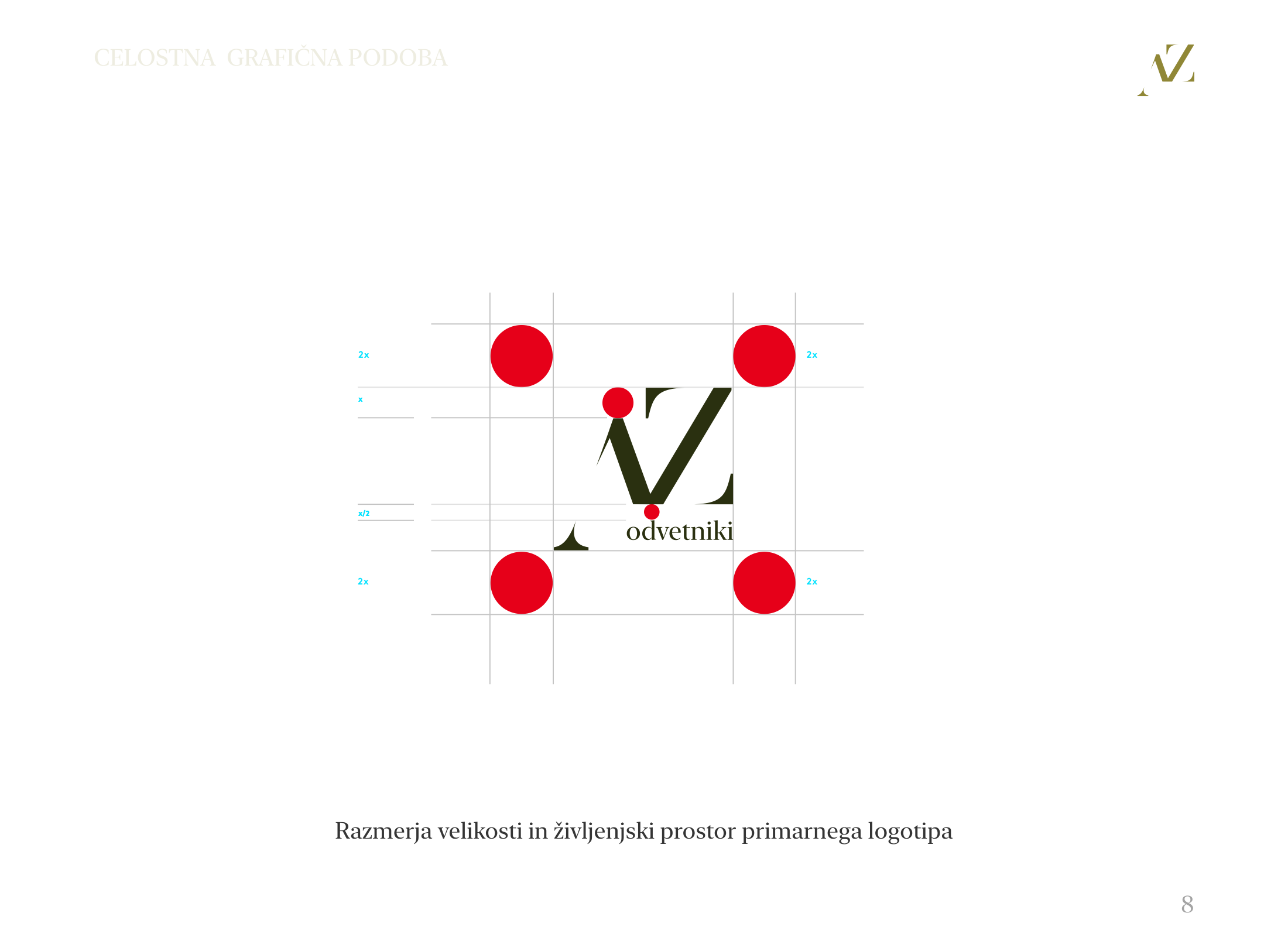
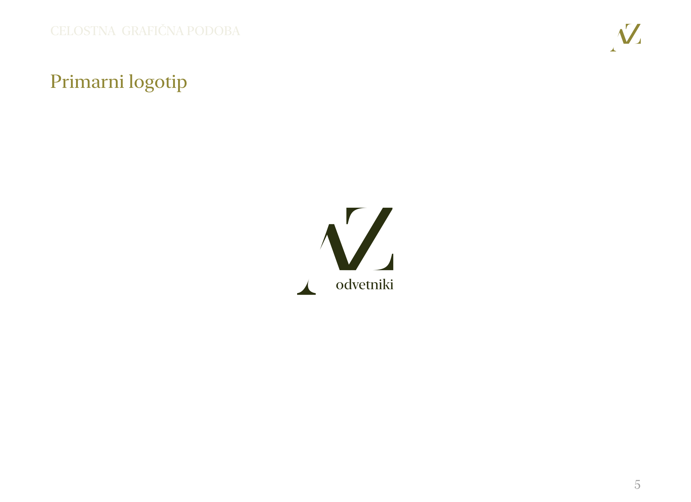
Primary logo
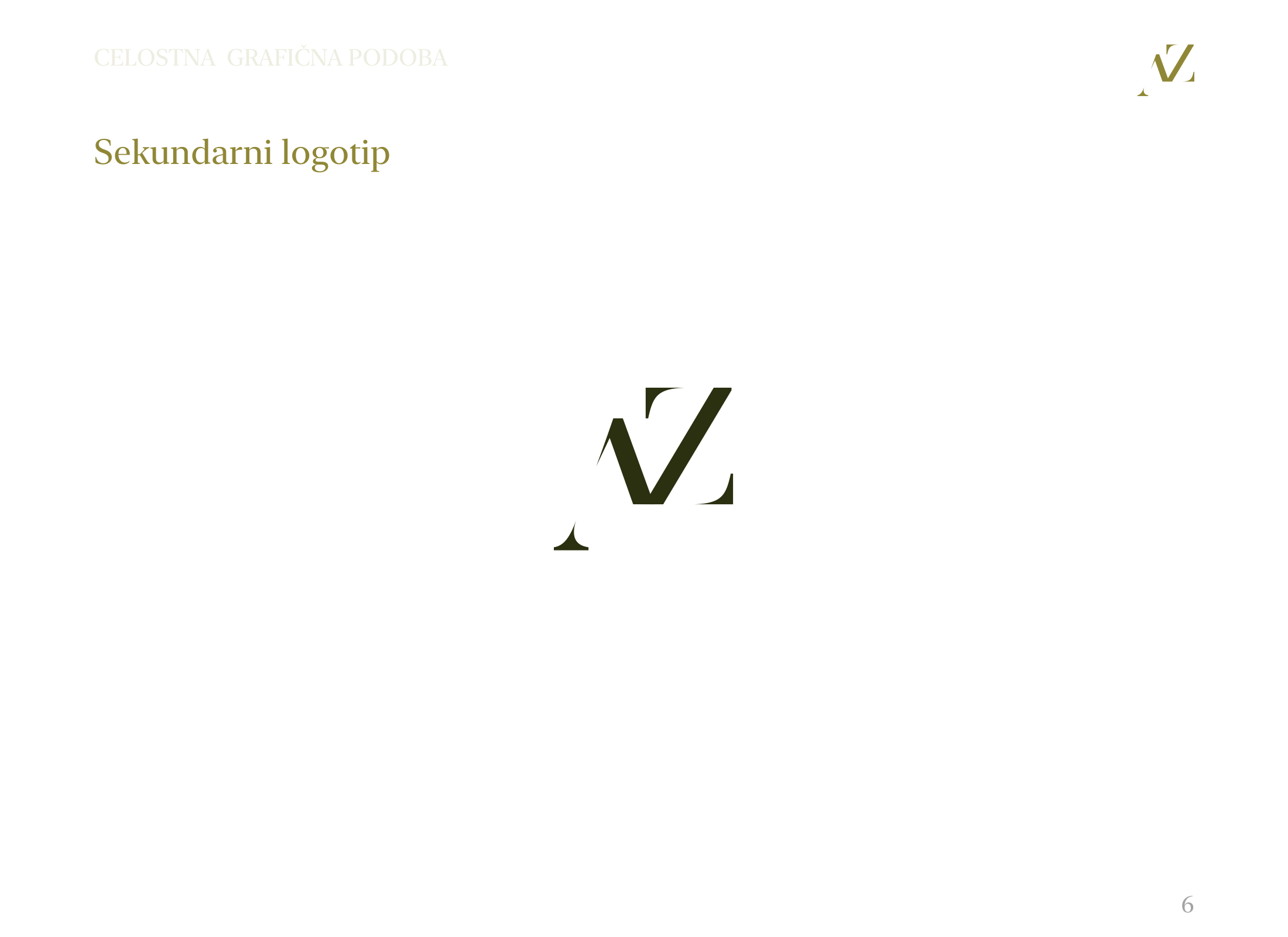
Secondary logo
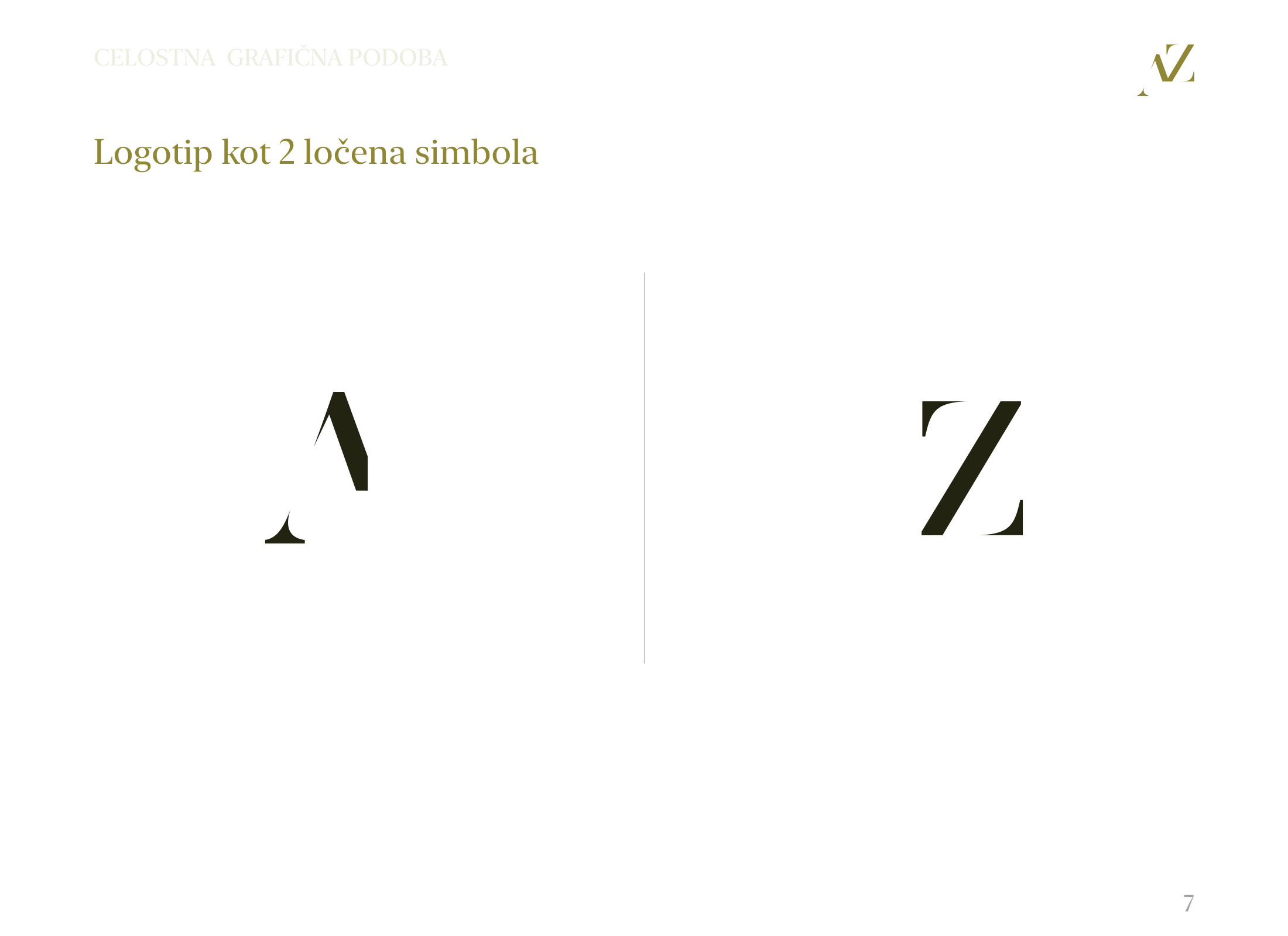
Symbol system
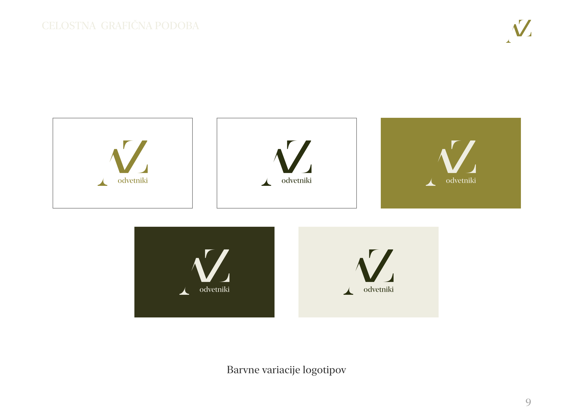
Color variations

Logo
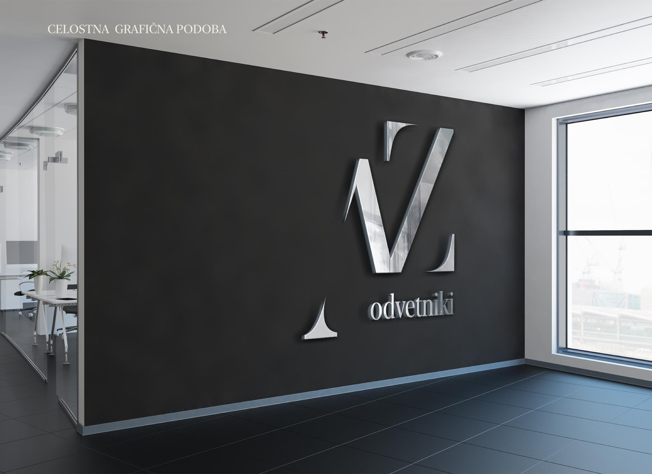
The logo mockup acts as the identity's cinematic opening frame, establishing a restrained but premium first impression.
CGP Materials
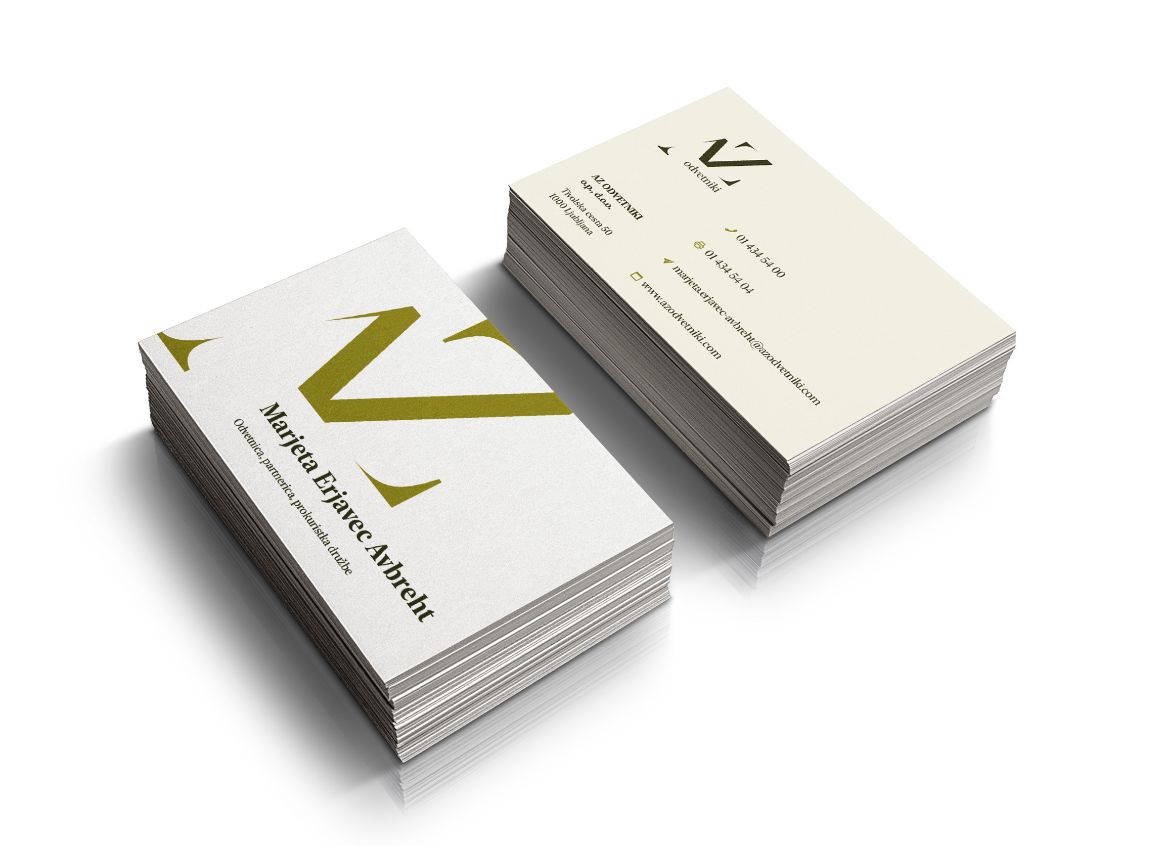
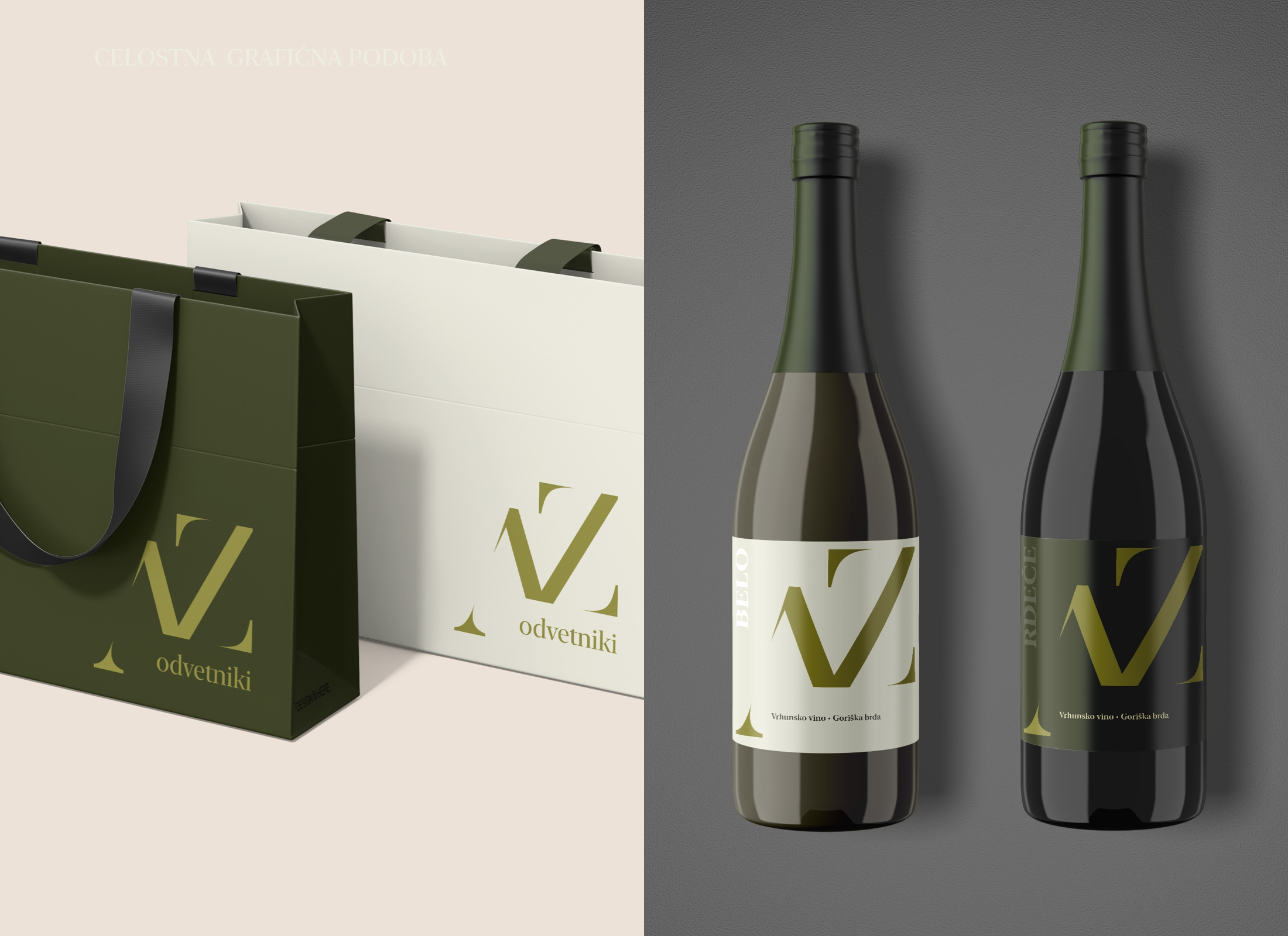
Paper and bag mockups show how the system can extend into client-facing materials while staying minimal and confident.
Relationship Detail
Premium relationship materials give the identity a more personal register without weakening the serious legal-service tone.
Outcome
The AZ Odvetniki identity translates a restrained visual direction into a practical CGP system, connecting logo rules, printed materials and presentation assets into a clear, credible legal brand presence.