
Pekarna Pečjak
E-commerce UX/UI
A warm commerce system built around product browsing, category clarity, mobile shopping and generous bakery atmosphere.
View live siteProject holder
Madwise
Role
Ecommerce UX/UI, responsive web system and mega-menu design
Year
2026
Project overview
Building a scalable digital ecosystem for a modern bakery brand.
The Pečjak platform combines ecommerce, a product catalogue, recipes, promotions, location and store-finder logic, responsive browsing and brand storytelling into one coherent digital system. The design challenge was to make a broad bakery offer feel warm, clear and immediately shoppable without losing the everyday familiarity of the brand.
Ecommerce
Online store and catalogue logic for broad bakery assortments.
Content & recipes
Recipes, advice and editorial content that add everyday usefulness.
Store locator
Store, pickup and opening-hour logic for physical availability.
Responsive experience
Clear browsing and shopping patterns across all screen sizes.
Information architecture
Clear structure.
Logical paths.
The navigation structure makes the bakery offer easier to scan: users can move from shopping to catalogue browsing, recipes, locations and brand information with a minimal number of decisions.
Mobile evolution
Wireframe and interface, moving in sync.
A synchronized mobile product page presentation: structure on the left, final interface on the right, with one shared scroll position controlling both layers.


Design system
A system built for recognition.
A modular UI layer keeps the Pečjak experience warm, recognizable and easy to extend across shopping, content and campaign moments.
Typography
Playfair Display
Headlines
Brand moments
Inter
Readable UI text for product data, prices and actions.
Colors
#7a2430
Burgundy
#151c27
Deep navy
#f4ead8
Cream
#c9aa7b
Warm beige
#17120f
Dark text
Components
Icons
Responsive experience
A flexible system from wide catalogue browsing to compact mobile shopping.
The interface was designed as a responsive system: desktop gives space to category browsing and richer navigation, while mobile keeps product decisions, content and store information focused in a narrow flow.
Desktop / 1440px

Mobile / 390px

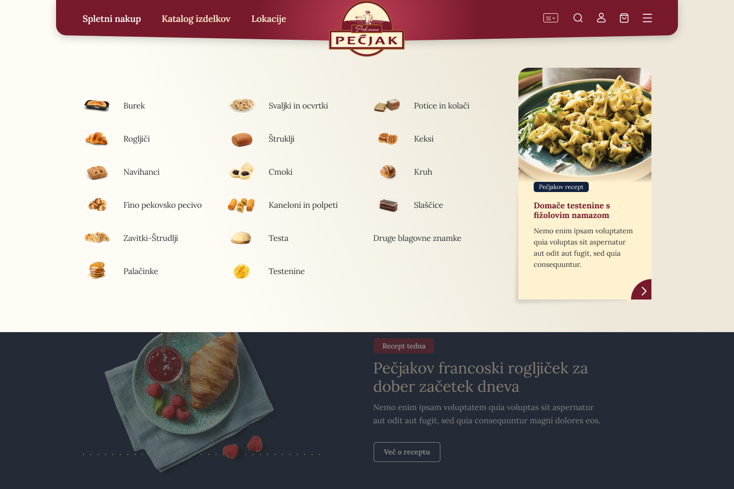
Menu / navigation
UX details
Details that make the experience easier to use.
Each interface detail supports a practical user decision: what to buy, how to browse, where to find it and why to keep exploring.
Product discovery
Product cards keep offer, price and action close together.
The listing system makes repeat purchasing easier by keeping product imagery, package options, pricing and cart action in one compact decision area.
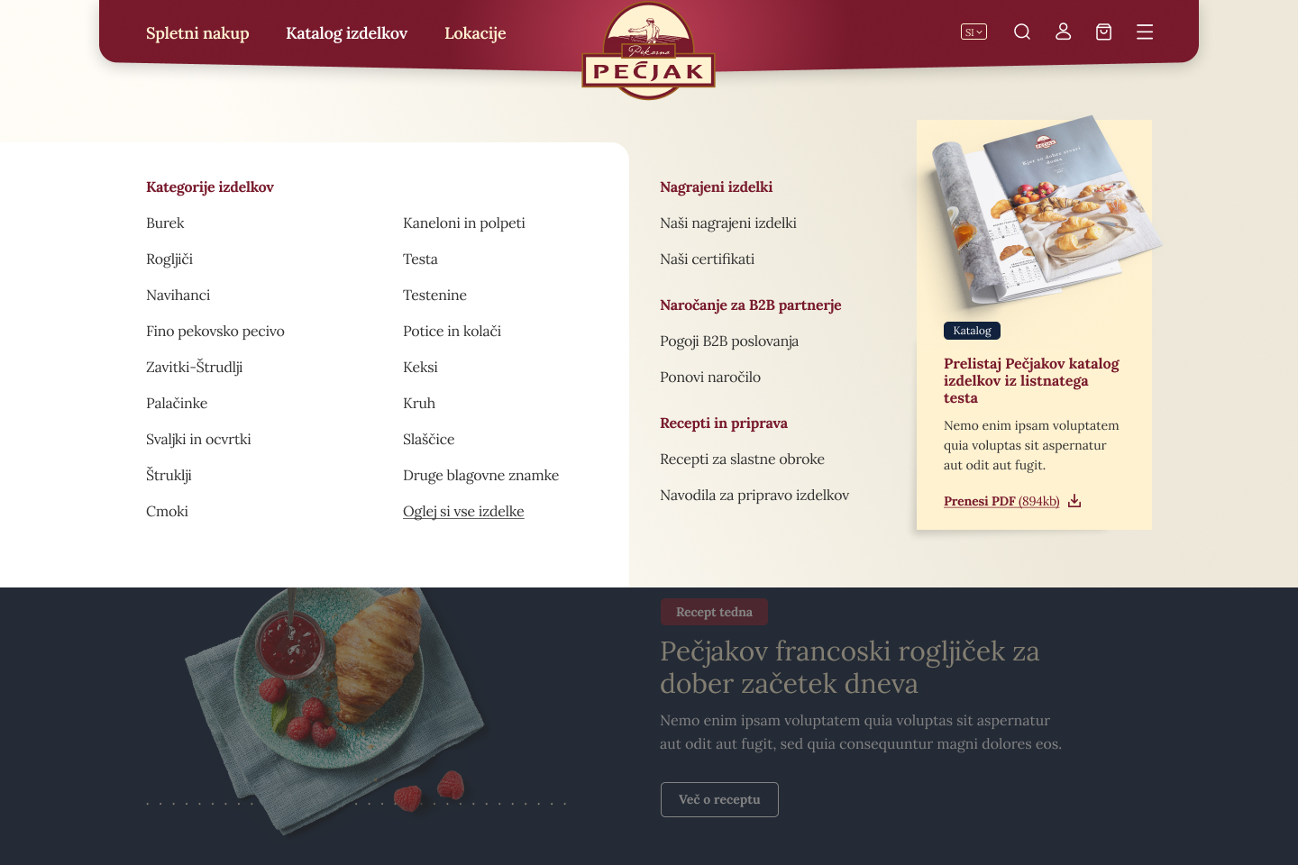
Mega menu
Large category sets become a browsable navigation system.
The menu states create a quick route through bakery categories without hiding the brand warmth behind a purely functional catalogue.
Store locator
Location content connects shopping intent with physical access.
Store and pickup patterns support practical user needs after discovery: where to buy, where to pick up and how to continue offline.

Recipes & editorial
Content moments give the commerce system a warmer reason to browse.
Recipe and editorial sections broaden the experience beyond transactions and help the brand feel useful in everyday kitchen contexts.
Final interface showcase
A warm commerce interface told through layered product moments.
The final screens are presented as an editorial system rather than a uniform screenshot dump: cropped catalogue moments, mobile flows, navigation states and content surfaces build a fuller picture of the product experience.
Outcome
A clearer and warmer digital experience for everyday bakery products.
The result is a more structured ecommerce experience that can carry a large bakery catalogue while preserving warmth, brand appetite and practical shopping clarity.